First impressions matter. We are told never to judge a book by its cover because we do, all the time and not just books.
A 2006 Canadian study put the timing for first impressions at 50 milliseconds. It would be hard to get any shorter – that’s almost as fast as messages can arrive in the brain. It’s about as long as a single frame of TV – so fast we don’t notice any pause when watching. What’s more, people like to be right. So we won’t generally change that initial impression, just look for and find more reasons to back it up.
Design matters
Humans can perceive visuals and make flash judgements far quicker than we can read or consciously take in information. The first impression of a website is based on the design – colours, layout, images, font, sizes. That all happens way before the visitor reads what your site is about.
Good design confers trust, expertise, significance, mood and brand. It lets the visitor subconsciously relax, becoming more open. They know they are in the right place.
Web design trends change, and while you don’t always want to be following the pack, it’s easy for a web-savvy visitor to tell if it has been a while since your site was updated. If you take another look at this link to the 50 milliseconds study there’s an image of a website from 2006 used as an example. To you it probably looks “off” even if you aren’t sure why. Take a walk down memory lane and look at the evolution of the Google logo.
Times change, but things also stay the same. There are conventions built up around web design. It’s not impossible to break them but you run the risk of confusing or frustrating customers. They expect certain elements to be clickable, like the site logo to take them to the homepage. The menu tends to be on the right and a search bar somewhere near the top.
If you don’t follow these “rules” then a great design is even more important to help show visitors the basics of how to use your site.
One easy way to tell if your website is working on first impressions is the bounce rate. If a significant number of people are closing your website almost instantly – within the first eight or so seconds – then there is a problem.
Visitors have an expectation in their mind when they click over from a search engine and will make a snap decision about whether your site conforms to that expectation – whether they feel safe and secure, understood, catered to, and in the right place.
There’s not enough time to convey that all in text – even with huge type about your great offers. That sense has to come from the design as the first thing the visitor absorbs, that will then get them reading all the great things about you.
“Great design” in practice
“Looking great” doesn’t mean just one thing. Our two examples look great, but also very different.
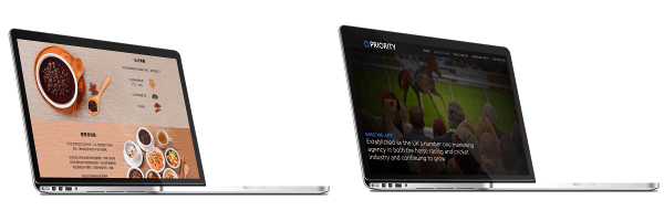
These website redesigns were done by Bright White Space and you can read the Maan Kitchen case study and Priority SMS case study to find out more.
The Maan Kitchen and Priority Sports Marketing websites have a very different look but it’s one catering to their audience. You go to a restaurant’s website and you want to see pictures of amazing food that are given room to shine. Or you are looking for an innovative, data-driven marketing solution. You want a slick website that “gets” you and lets you know you’re in good hands.
So if you think it might be time to update your website take a look at more work done by Bright White Space.
Back